
Nike Innovation Labs
Role: Sr Brand Designer
The newly formed Nike Innovation Labs is an internal tech incubation arm of Nike, comprised of Nike Valiant Lab (NVL) and the established Nike Sport Research Lab (NSRL).
Nike Valiant Lab is focused on building businesses and product that fit into the Nike ecosystem. NVL consistently housed multiple rotating entrepreneur-in-residence who building and testing new businesses.
Nike Sport Research Lab is focused on making cutting-edge performance apparel and athletic solutions. NSRL is home to the industry’s leading sport scientists and designers.
My team’s objective was to empower our labs by supplying key messages and creative solutions so they can confidently articulate their projects and share insights across the company. The ultimate goal of my work is to nurture relationships by delivering the lab’s value and depth of work consistently.
Problem 1:
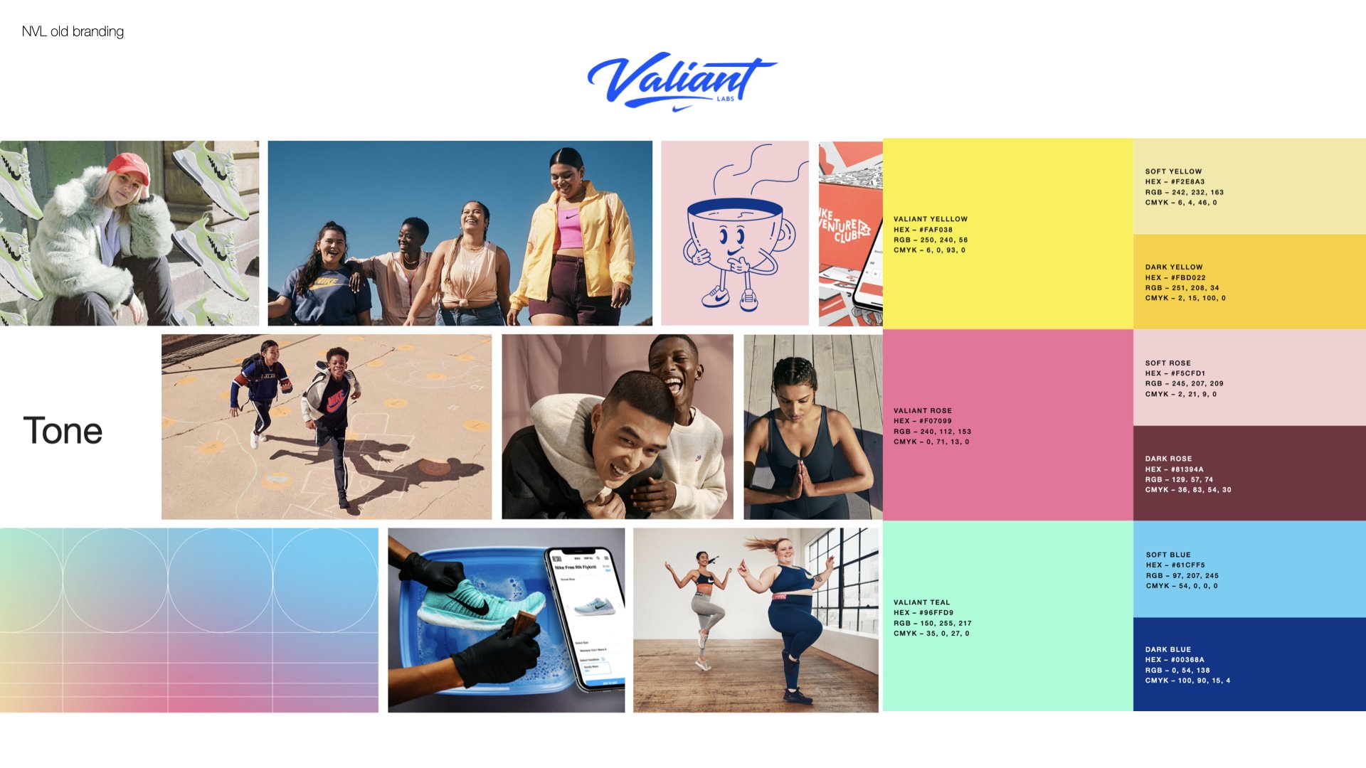
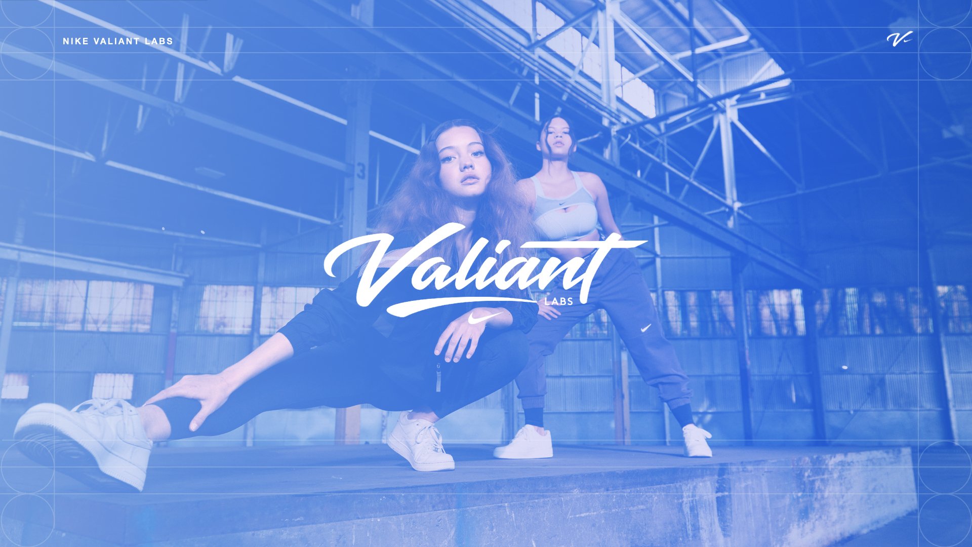
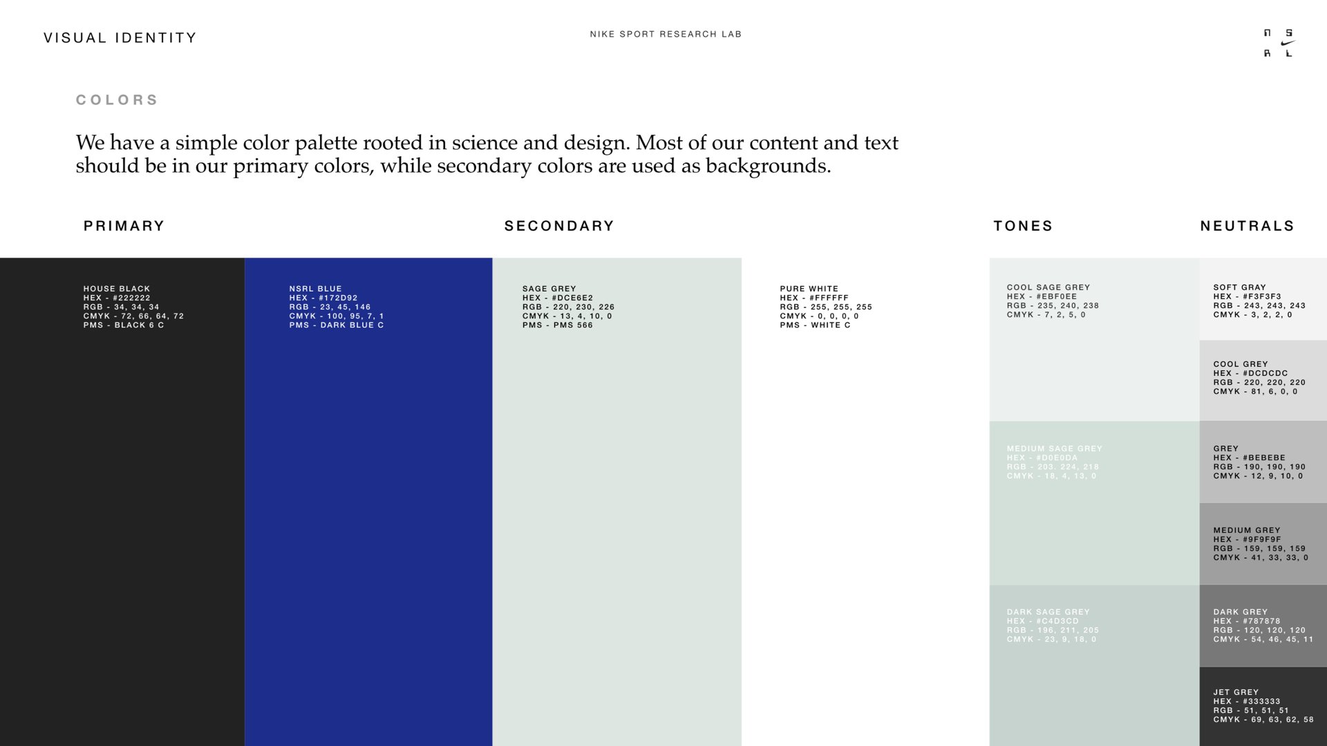
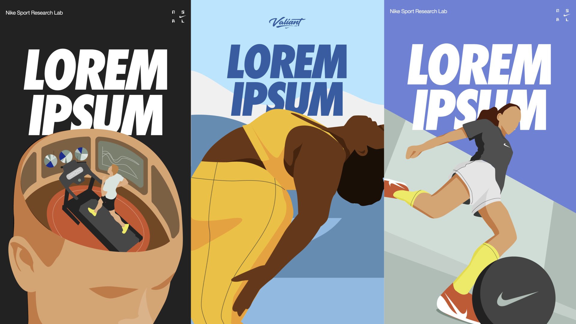
Although NVL and NSRL already had some branding, the two visual identities were starkly different. NVL’s art direction was very bright and colorful that can come off as immature. NSRL’s art direction was more serious and high tech but the unconventional layouts made the identity almost entirely unaccessible to any internal employees to adhere to.


Results
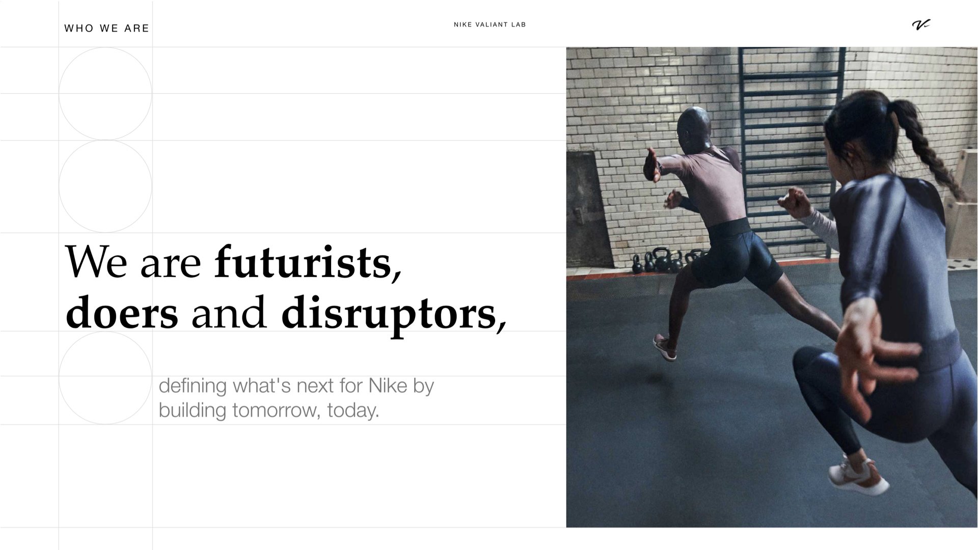
My goal here was merging the two brands visually to align with the Innovation Labs strategy. The leadership at NIL aims to distinctively show up as the science-forward, inventive and disruptive branch within the Nike ecosystem while honoring the established legacy of both labs.
One of the first things I did was an audit on both of the labs identities. For visual design, I identified similarities and differences between the labs, and learned what both brands are known for, what the most recognizable aspects are for both.
After many discussions with leadership and interviews, we nailed down both lab’s voice and tones.
With these information, I found ways to separate and unify the lab’s identity. I kept both of their logos as they were already known for them. For NVL, I stripped the colors and kept their Valiant blue. For NSRL I also brought the color palette back to the basics but kept their cool grey and dark blue. I aligned both lab’s typography to Nike’s typography, so there’s a seamless experience if they were to appear in the same plane. I also refined both lab’s other design elements and introduced a simple-to-recreate illustration system.


Problem 2:
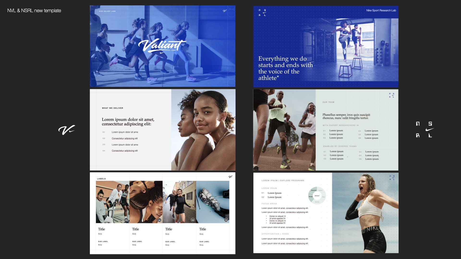
The two labs had historically relied on agencies to provide brand design. This has caused significant issues for the employees as agency designs were often not accessible to researchers, causing many to abandon the brand guidelines entirely. My goal here is to provide accessible design solutions and help educate on best practices while using brand elements.
Below on the left is NVL’s deck template: The colors are being interpreted in ways that are very sporadic. On the right is NSRL’s deck template: The template provided by the agency was too difficult for researchers to interpret, so they either abandon them entirely, or they use it incorrectly - see last slide.

How each lab’s brand identity was interpreted
Results
My goal was to leave the teams with tools that are accessible to distribute and use.
I built out a brand guidelines to educate our employees on our brand design. This was specifically useful and helpful when distributing to their newer designers and external agencies who handle a lot of Nike’s events and campaigns. I created a suite of tools to allow for brand consistency long after my departure. This includes presentation + email templates, printed materials, illustrations, approved photography, etc.
After finding alignment for both
Problem 3
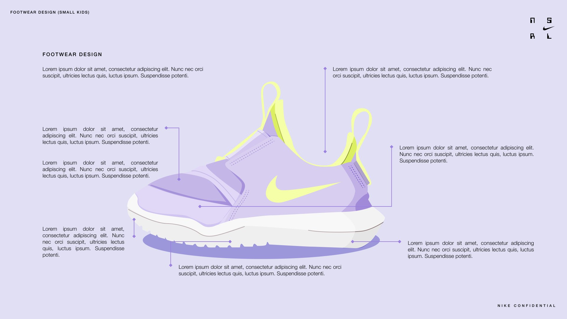
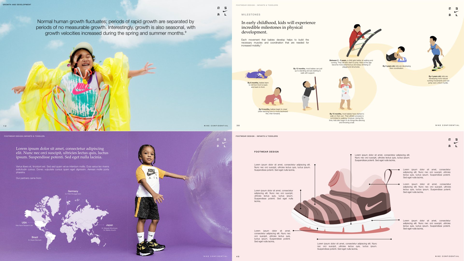
One issue that the NSRL had trouble with was packaging their insights. Their research are exhaustive and extremely in depth, and sometimes that can be hard to digest for their stakeholders. They had just finished a big research into kids footwear and they wanted to show off the learnings.
Results
Our team, in collaboration with the researchers, compiled a book - Kids Science. The book was a contextualized and digestive editorial piece packed full of research and insights surrounding childern’s growth in different life stages and what the considerations should be for their footwear. This was distributed among our business partners and the C-suite to show off the thorough work the NSRL has been doing.
We also set up a layout and process for future volumes and other projects related to packaging of research insights.

Information redacted*
Information redacted*

Style exploration

Layout of book process